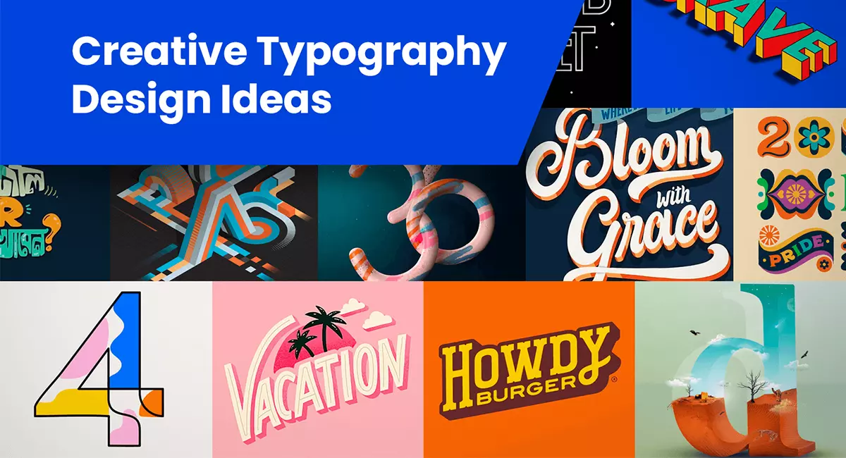
Typography in web design is more than just an aesthetic choice; it plays a crucial role in enhancing user experience, brand identity, and SEO. In this blog, we explore seven essential ways typography enhances web design and provide actionable tips for creating visually appealing, user-friendly, and SEO-optimized websites.
1. How Typography Enhances Readability and User Experience
Typography greatly impacts how easily content is read and understood, which in turn affects the overall user experience. Choosing the right fonts, sizes, and spacing can significantly improve readability. Fonts like Arial, Helvetica, and Georgia are known for their clarity on digital screens. A comfortable font size, typically 16px or larger for body text, is essential.
Tip: To prevent text from looking cramped, use a line height of 1.5 to 1.6 times the font size. Break up large blocks of text with headings, bullet points, and shorter paragraphs for better readability.
2. Establishing a Clear Visual Hierarchy with Typography
Visual hierarchy is key to guiding users through content, emphasizing the most important information first. By varying font sizes, weights, and styles, typography helps establish this hierarchy. For example, using a larger, bold font for headings and a smaller, regular font for body text draws the reader’s attention to the main points.
Tip: Consistently use heading tags (H1, H2, H3) to logically structure your content. This not only enhances readability but also helps with SEO by signaling content organization to search engines.
3. Building a Strong Brand Identity with Typography
Typography is a powerful tool for branding. The fonts you choose reflect your brand’s personality—whether modern, traditional, playful, or professional. For instance, a law firm might use a classic serif font to convey reliability, while a creative agency might opt for a bold, sans-serif font to appear dynamic and contemporary.
Tip: Choose fonts that align with your brand’s tone and values. Limit your choices to two or three complementary fonts to maintain a cohesive look throughout your website.
4. Improving Web Accessibility with Effective Typography
Accessible typography ensures that all users, including those with visual impairments, can easily read and interact with your content. Select fonts that are legible, avoid overly decorative or script fonts for body text, and ensure adequate color contrast between text and background.
Tip: Follow accessibility guidelines like the Web Content Accessibility Guidelines (WCAG) to make your typography inclusive. Use tools like the Color Contrast Checker to ensure readability for all users.
5. How Typography Choices Support SEO
While typography itself doesn’t directly impact SEO, it enhances user experience, which does. When users find your content easy to read and engaging, they are more likely to stay longer, reducing bounce rates and boosting SEO rankings. Proper use of heading tags (H1, H2, etc.) also signals the structure and relevance of your content to search engines.
Tip: Use heading tags strategically, including your focus keyword where relevant. Ensure your content is easy to scan with well-structured headings and subheadings.
6. Adapting Typography to Different Devices for Better User Experience
With a variety of devices used to access websites, it’s crucial that your typography adapts to different screen sizes. Responsive typography dynamically adjusts font sizes, line heights, and spacing to provide an optimal reading experience on all devices.
Tip: Use relative units like “em” or “rem” for font sizes instead of fixed sizes like pixels. This approach ensures text scales correctly across different devices, maintaining readability.
7. Ensuring Consistency in Typography Across All Pages
Consistency in typography helps create a unified look for your website, establishing brand recognition and trust. Inconsistent fonts or styles can make a website appear unprofessional and disorganized.
Tip: Develop a typography style guide that outlines the fonts, sizes, and styles to be used for different elements (headings, body text, buttons, etc.). This ensures consistency across all pages and maintains a polished appearance.
Conclusion
Typography is a fundamental component of web design that significantly impacts user experience, branding, accessibility, and SEO. By carefully selecting the right fonts, maintaining a clear visual hierarchy, and ensuring readability and accessibility, you can create a website that is both visually appealing and user-friendly. Remember, good typography is about effective communication, not just aesthetics.
Additional Resources:
- Internal Link: Learn more about enhancing web accessibility in our guide, “How to Improve Web Design Accessibility.”
- External Link: Follow accessibility guidelines from the Web Content Accessibility Guidelines (WCAG).
- Checking Other Blog: Azis Web


